How Microsoft made big conversion gains with small color tweaks
Why design and color usage matters in conversion optimization.
How Microsoft made big conversion gains with small color tweaks
Why design and color usage matters in conversion optimization.


Some of the most impactful experiments run on high-traffic websites involve improvements in color.
The right colors can mean the difference between a buy and a bounce. A prime example of this is a case study from Bing. Ron Kohavi, an expert in online experimentation and author of the book “Trustworthy Online Controlled Experiments” shared this experiment in a Harvard Business Review article. The test made subtle changes to the blue, black, and green on the Bing search results (Figure 1).


The change increased revenue by $10 million per year. But why did such a “small” change lead to such a big increase? A few reasons are likely when you look closely at Figure 2.

Reason one: Not enough contrast
The first reason is not enough color contrast.
Contrast is how different the foreground color is to the background color in terms of light and darkness. It’s written as a ratio that compares the first number to one. When it’s a 1:1 ratio, that means the contrast is the same. The higher than one it is, the more different it is. Contrast impacts how easy something is to read. When you inspect the contrast ratio of the blue and green on the white background you learn that the blue in base is WCAG 2.0 AAA accessible.
This contrast ratio for the blue in base is high enough for both normal and large text. But, the blue in the variant is even stronger as shown in Figure 3. This extra contrast makes the darker blue easier to read.
Control
The blue has a contrast ratio of 7.09:1.

Variant
The blue has a contrast ratio of 11.21:1

Figure 3: Contrast checkers, like WebAim (above) are a useful tool when you work with color.
When you inspect the green in base you find it’s only WCAG 2.0 AA accessible for large text. The green in the variant is better because it’s WCAG AA accessible for both large and normal text.
Control
The green has a contrast ratio of 4.25:1.

Variant
The green has a contrast ratio of 6.54:1

Figure 4: Normal text in the control green is hard for many people to read. The variant green is more legible.
Reason two: Too much contrast
Generally speaking, the stronger the color contrast ratio, the easier text is to read. But, there’s a tipping point.
When you reach the tipping point, you cross the line into reason number two control likely lost to the variant: too much contrast.
Working with contrast ratios is a delicate balance, but it’s worth the effort. Why? Because 2.2 billion people in the world experience some kind of visual impairment. So, lots of your customers likely experience color in unpredictable ways.
The control design uses pure black (#000) on pure white (#FFF). This has the highest possible contrast ratio of 21:1. This is too much.
Control
The black has a contrast ratio of 21:1.

Variant
The black has a contrast ratio of 13:77:1.

Figure 5: Pure black on pure white is the highest possible contrast ratio. It can sometimes be too much.
Contrast sensitivity (aka Irlen Syndrome) makes it hard for people to read pure black on pure white.
This happens when people’s eyes process high-contrast in a way that makes it “vibrate.” This vibration (called chromostereopsis for all you science nerds out there) happens for people with typical vision, too.
Figure 6 illustrates in color the visual effect of pure black on pure white for people that experience contrast sensitivity.

Knocking the pure black in base down to a dark gray in variant lowers the contrast enough to not trigger a chromostereopsis-like vibration.
Reason three: Backward visual weight
Finally, the last reason the experiment worked is that in base the colors have a backward visual weight.
Visual weight is how much something pulls the eye’s attention. Big, bold, dense, saturated, and high-contrast things draw the eye. Small, light, airy, muted, and low-contrast things don’t. In the control, the black has the heaviest visual weight. This draws the eye in and encourages it to be read. But search results are for scanning—not for reading.
Ideally, people’s eyes would bounce from one headline to another and only enter the black text if the headline and link don’t answer the question. The order in which the text gets read in the control is: first the small text, second the title, and third the link. In the variant, the order is: first the title, second the link, and third the body content shown in Figure 7.
Control
The visual weight order is black, blue, green.

Variant
The visual weight order is blue, green, dark grey.

Figure 7: How colors work together and their visual weight impacts the order in which information gets read.
Good color use isn’t just about individual colors. It’s also about how colors compare to and work with one another. That is proven by the subtle, yet impactful, color change in the variant.
It ain't easy
Though the change is subtle and probably seems simple, color experimentation is hard.
The average designer cannot pull off color change successes like these. Case studies like this one from Bing and Google’s “50 Shades of Blue” experiment give a false impression. It seems like all you have to do is change some colors to make frustrated customers happy. Then, it rains happy users and lots of money.
But, a LOT happens visually, psychologically, and technically when people glance at a screen. That makes color both an art and a science.
Designers think they're in control of the color. In reality screens, operating systems, devices, etc. all treat color differently in ways purposeful and accidental. Experimenting with color is about finding the right place on the spectrum to safely serve the largest possible segment of your audience.
If you enjoyed this article, check out my new book, "Design for Impact: Your Guide to Designing Effective Product Experiments."
")
Design for Impact
Your Guide to Designing Effective Product Experiments
Design for Impact features the Conversion Design process to help you and your team drive business growth. In it, Erin Weigel gives you practical tips and tools to design better experiments at scale. She does this with self-deprecating humor that will leave you smiling—if not laughing aloud.
The Good Experimental Design toolkit in the appendix presents everything you learn into step-by-step process for you to use each day.
Bonus! Get a FREE sticker when you order through this webshop.
€ 40,00 incl. VATAdd to cart
*This webshop serves EU customers only.
Or buy the book directly from my publisher at Rosenfeld Media.
Check out these resources
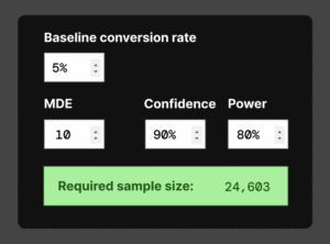
Frequentist sample size calculator
Use this frequentist sample size calculator to figure out how many people you need in each variant of your A/B test.
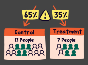
What you need to know about sample ratio mismatches (SRMs)
Randomization within experimentation is important. It’s how we isolate the change we aim to learn about. When randomization goes wrong, you can get an SRM.
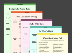
The Good Experimental Design toolkit
The Good Experimental Design toolkit templates and checklist level-up your experimental design. As Ronald Fisher learned, experiment data is only as good as the design you put into it.
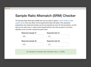
Lukas Vermeer’s manual sample ratio mismatch (SRM) checker
Randomization is the hidden power behind A/B testing. When randomized properly, the confounds in your data are completely removed. This allows you trust any cause/effect relationship you might observe.
A/B testing tool comparison
Speero’s A/B testing tool comparison website Helping you find the right experimentation tool quickly and easily Speero’s A/B testing too comparison website includes a comprehensive list of options. If you’re […]